

ISLE OF PLANTS
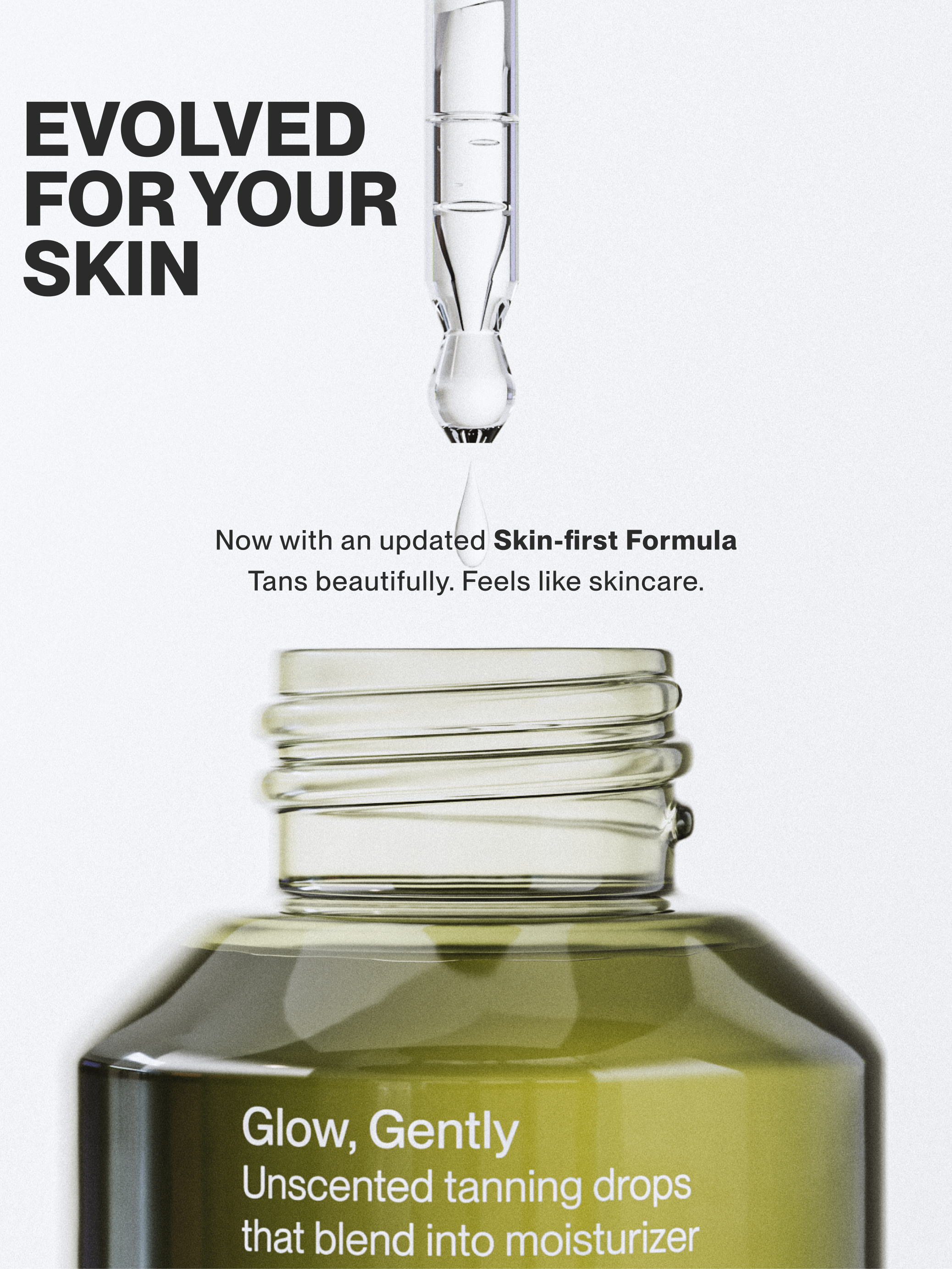
Skin-first self-tan made to feel like skincare
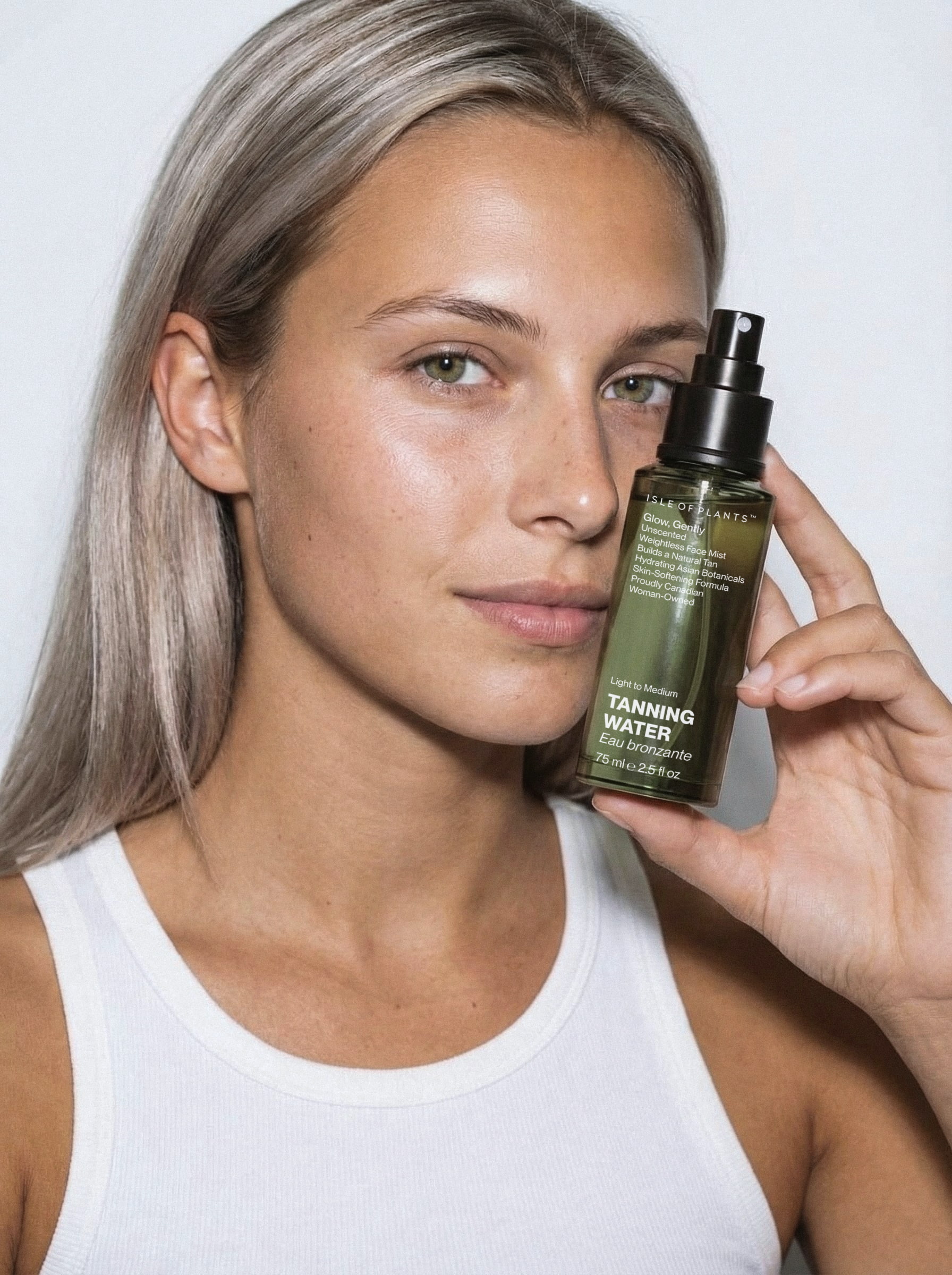
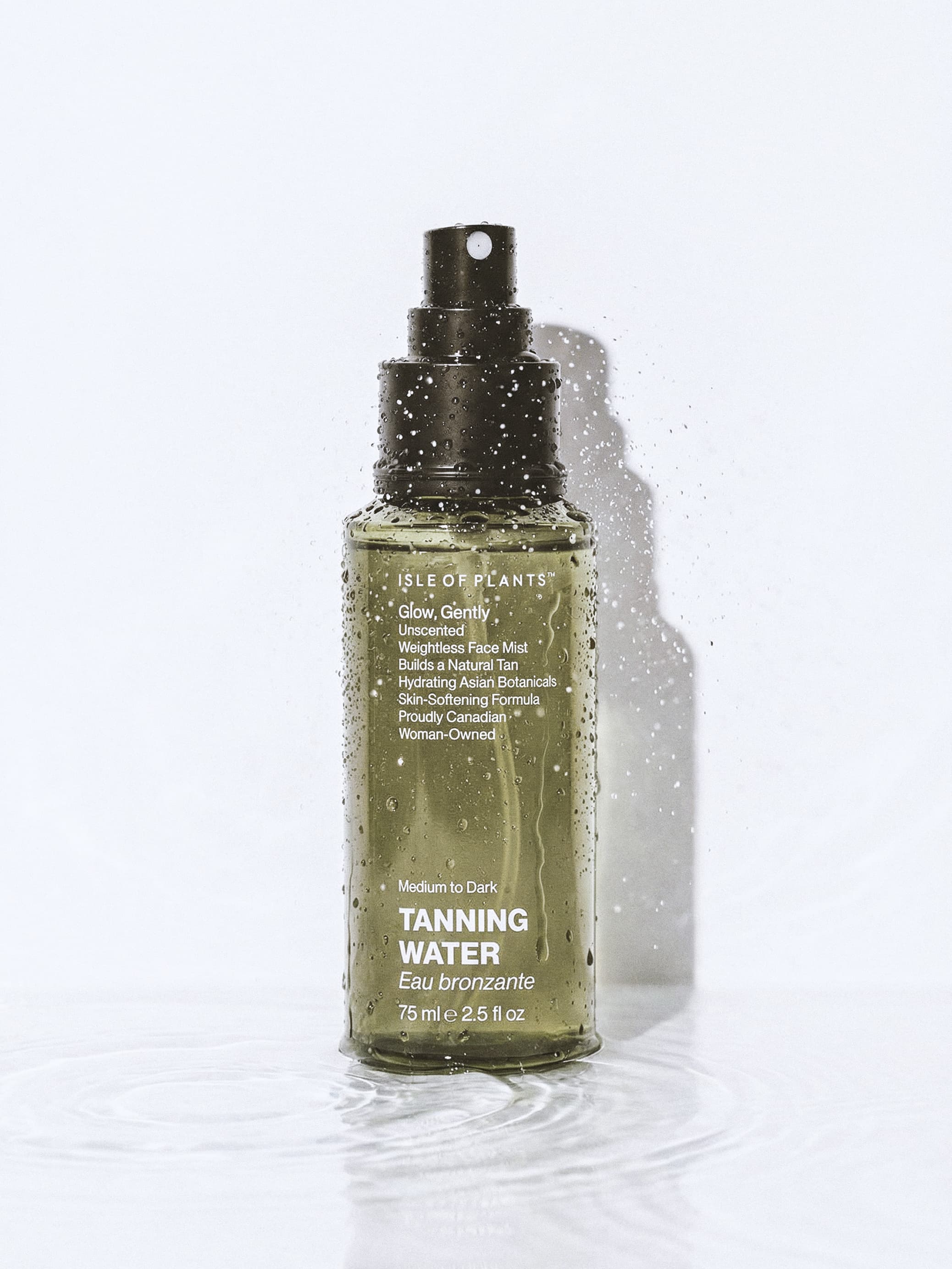
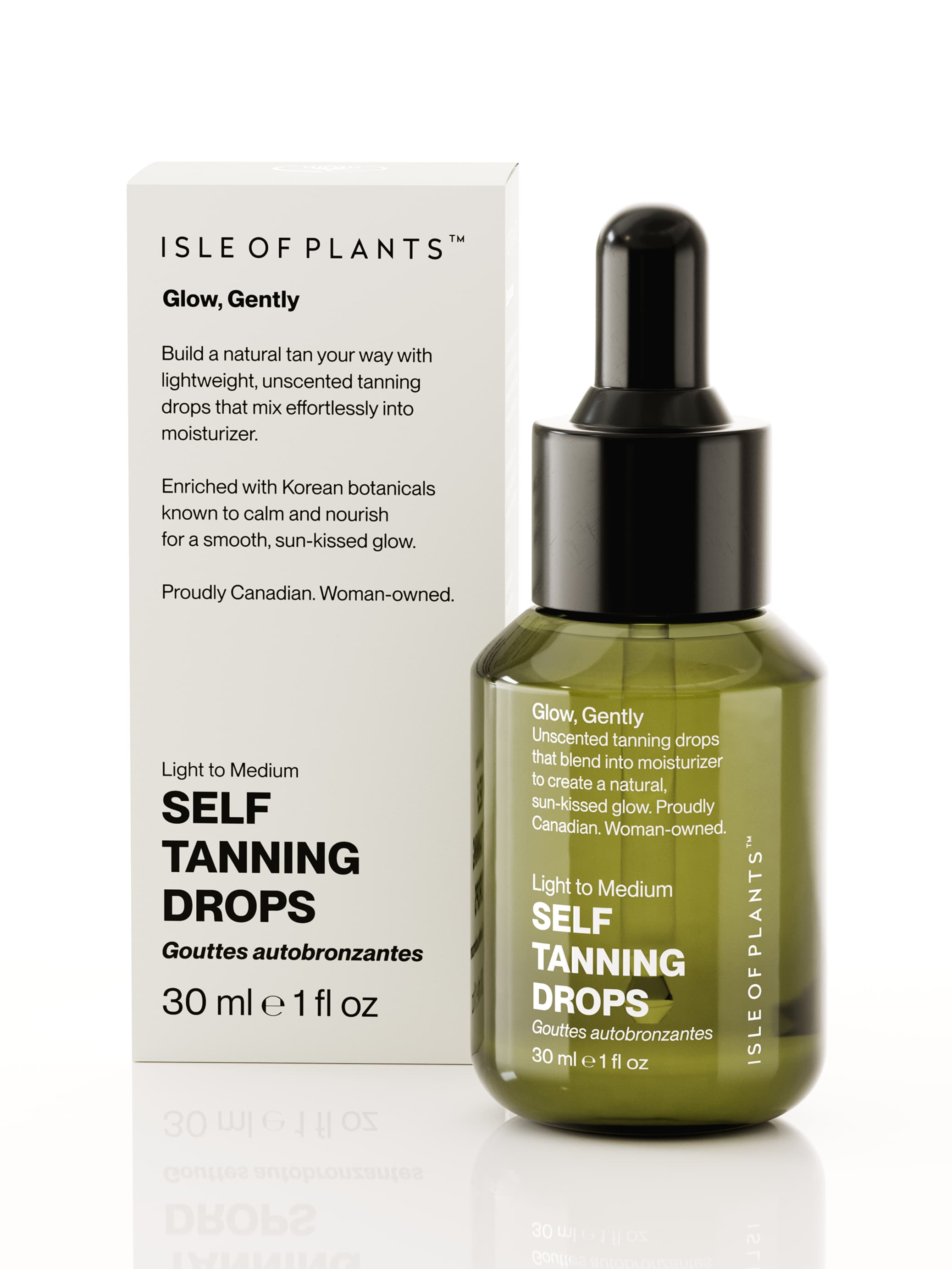
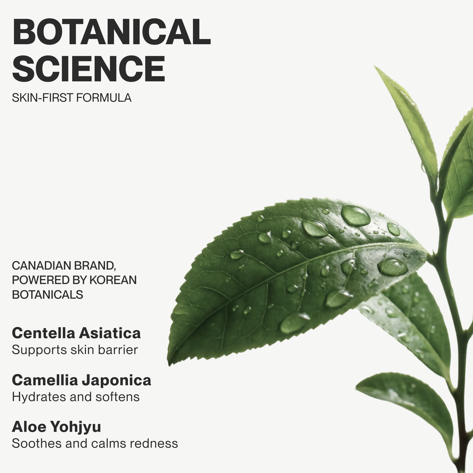
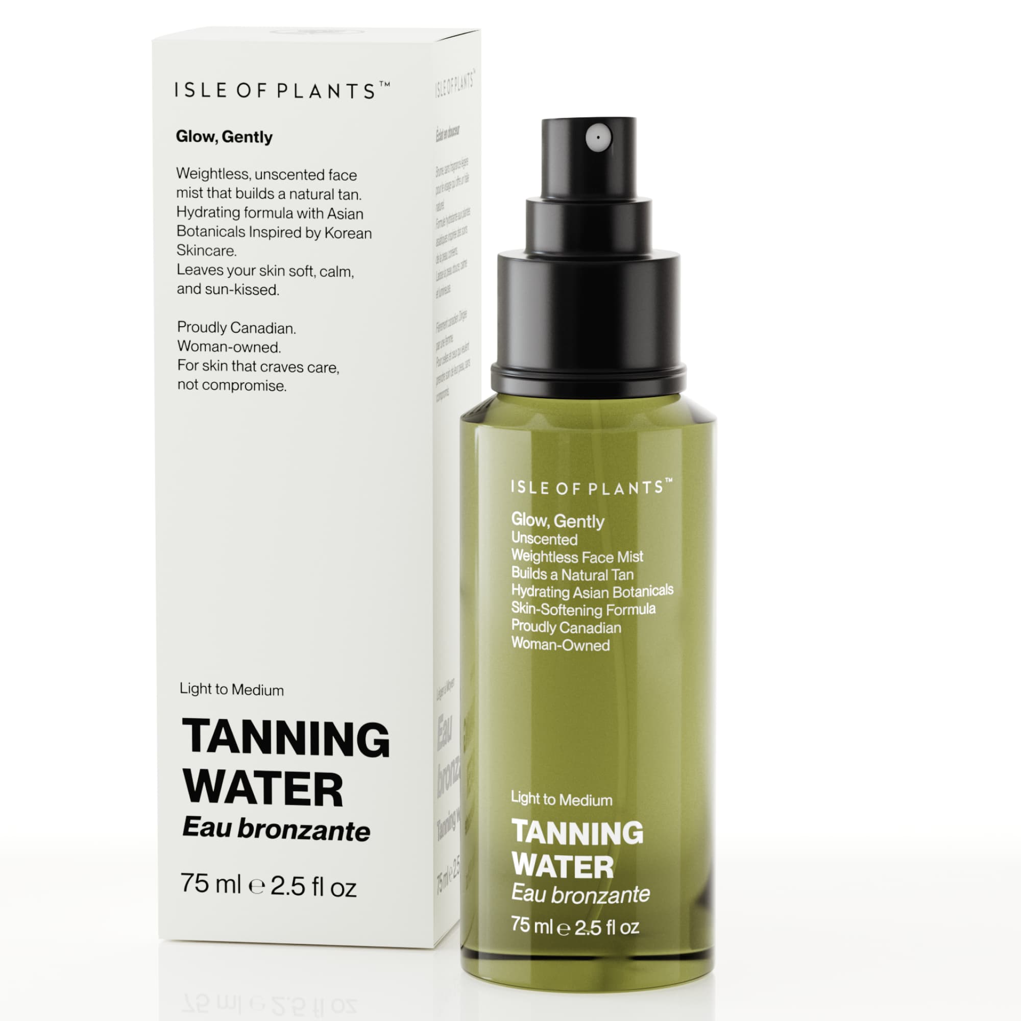
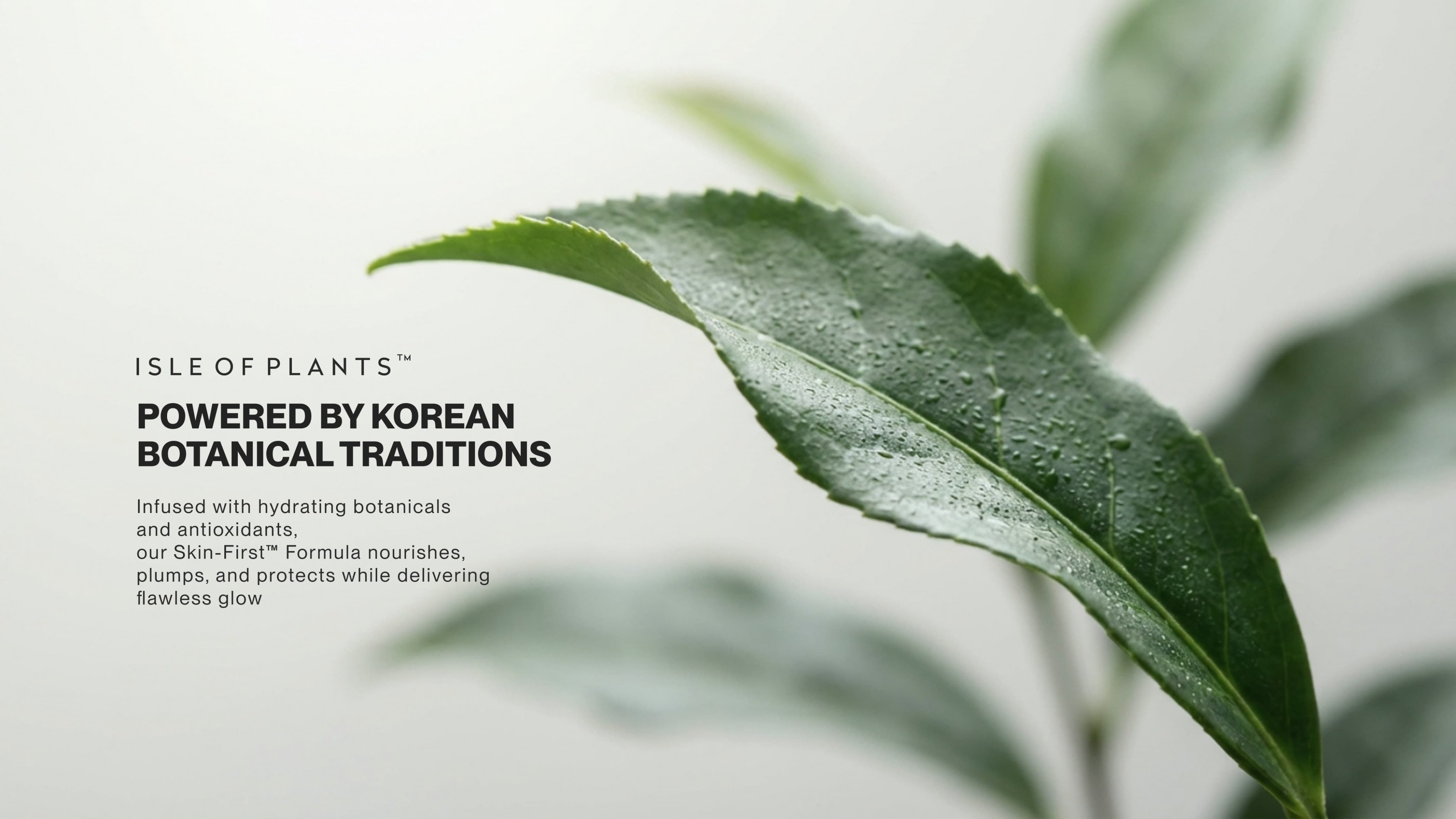
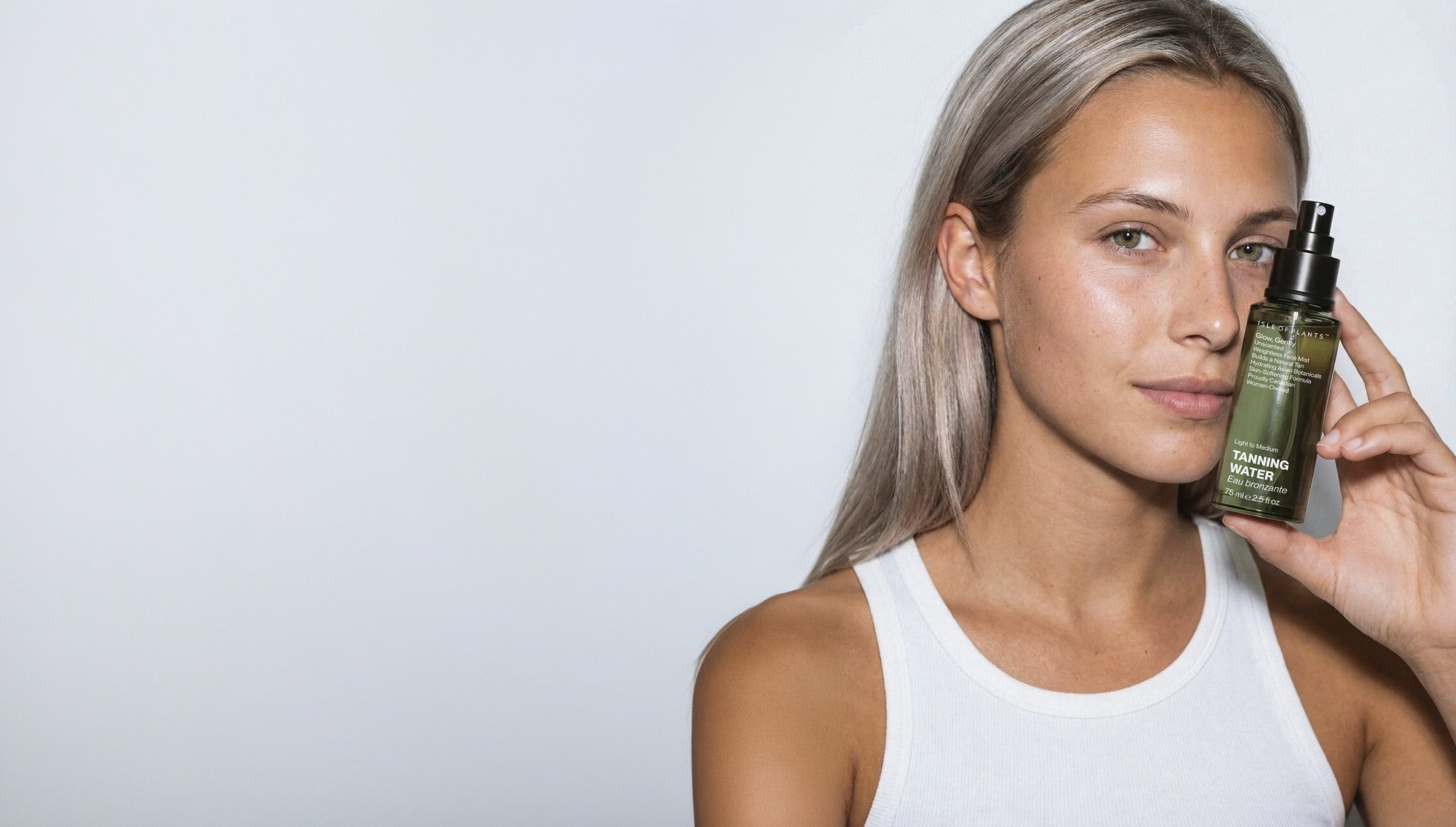
Isle of Plants is a plant-based self-tanning line from Quebec, rooted in the science of color-correcting. The client came with a bold brief: completely ignore the traditional bronze and orange packaging codes. In response, the identity embraces an intentional green palette that directly references the anti-orange theory behind the formula.
Since the brand is proud of its Quebec roots, using Montreal’s iconic PP font family was an obvious choice that just felt right. By pairing these local typographic lines with a clean, raw layout, the packaging system brings the founder's vision to life – turning a basic tanning product into an intentional, science-backed skincare ritual.
Feel your best summer day every day
Year
2025
Scope
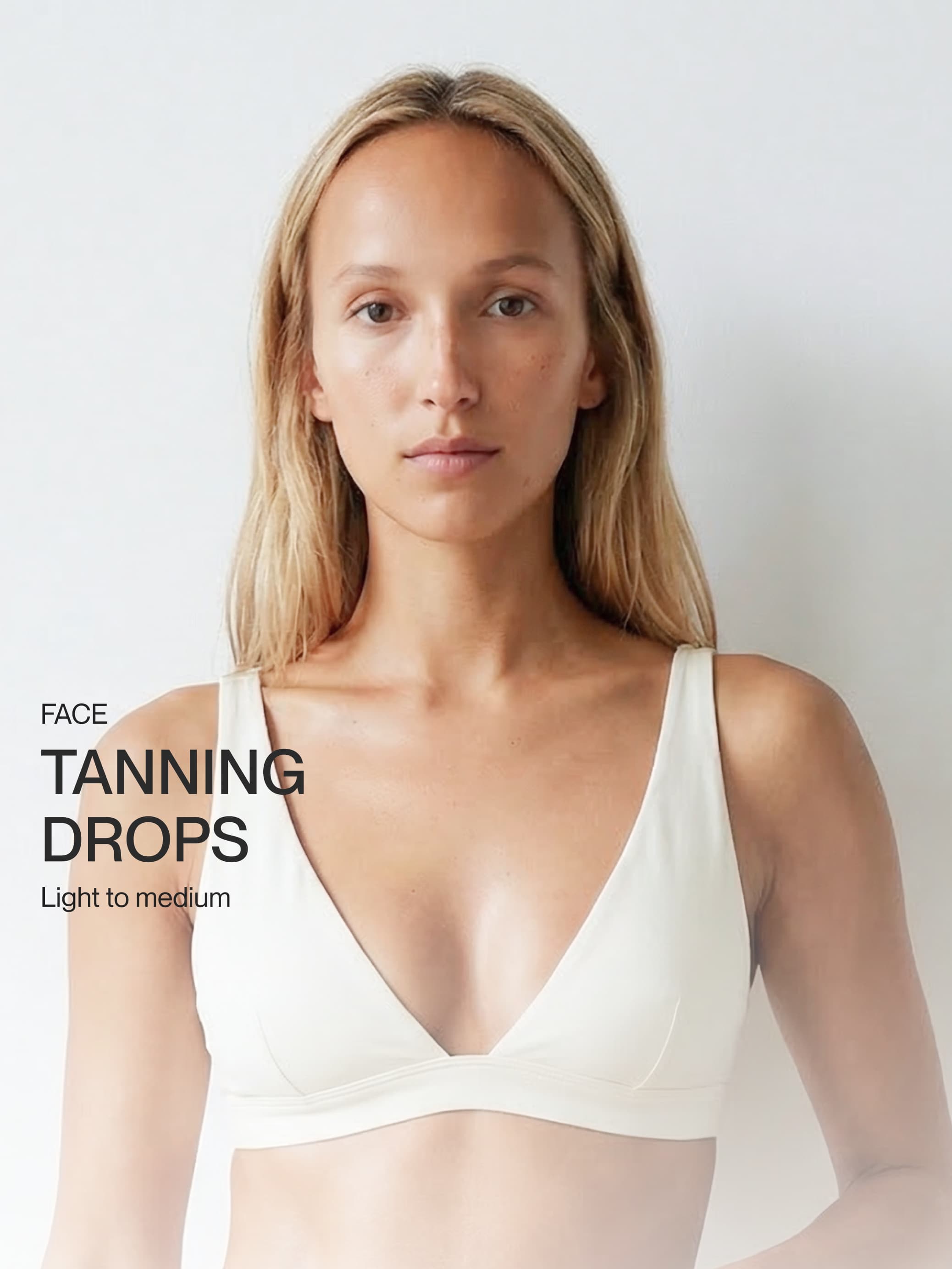
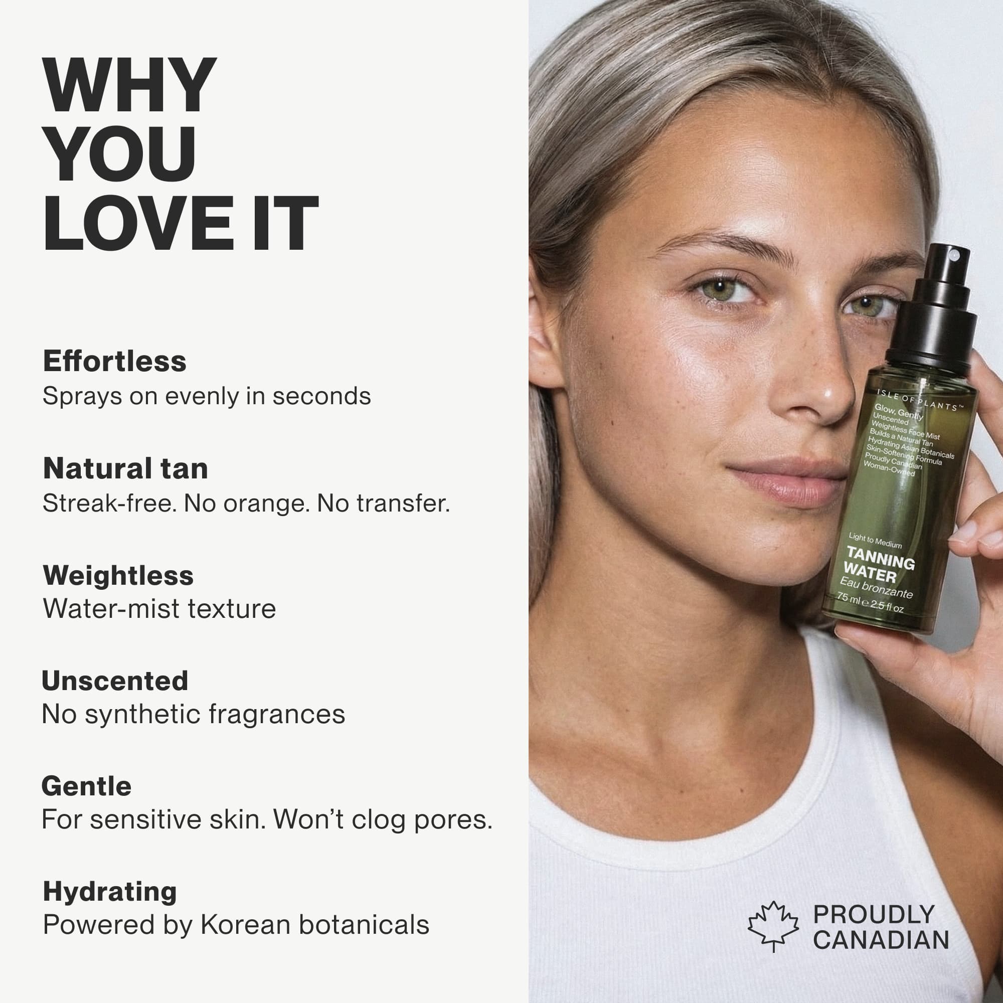
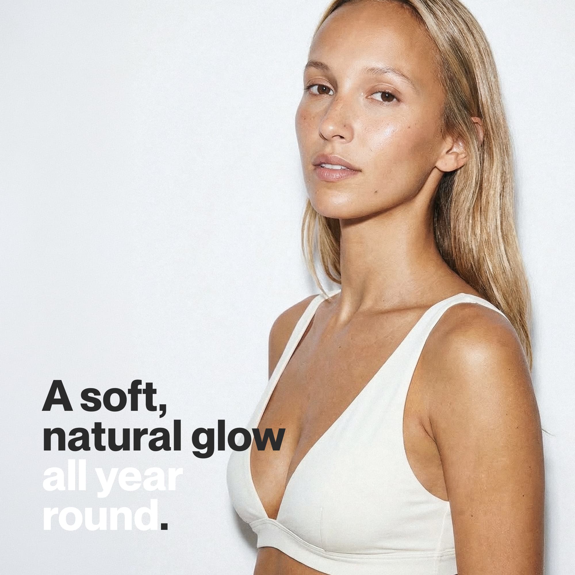
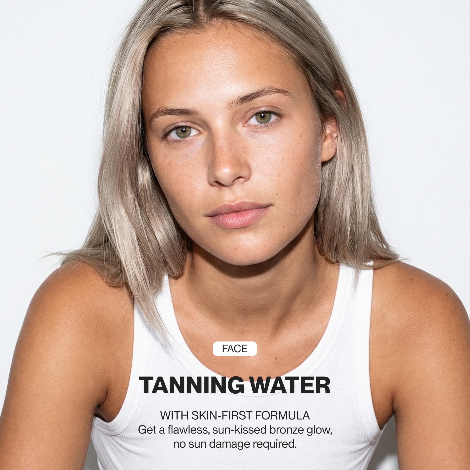
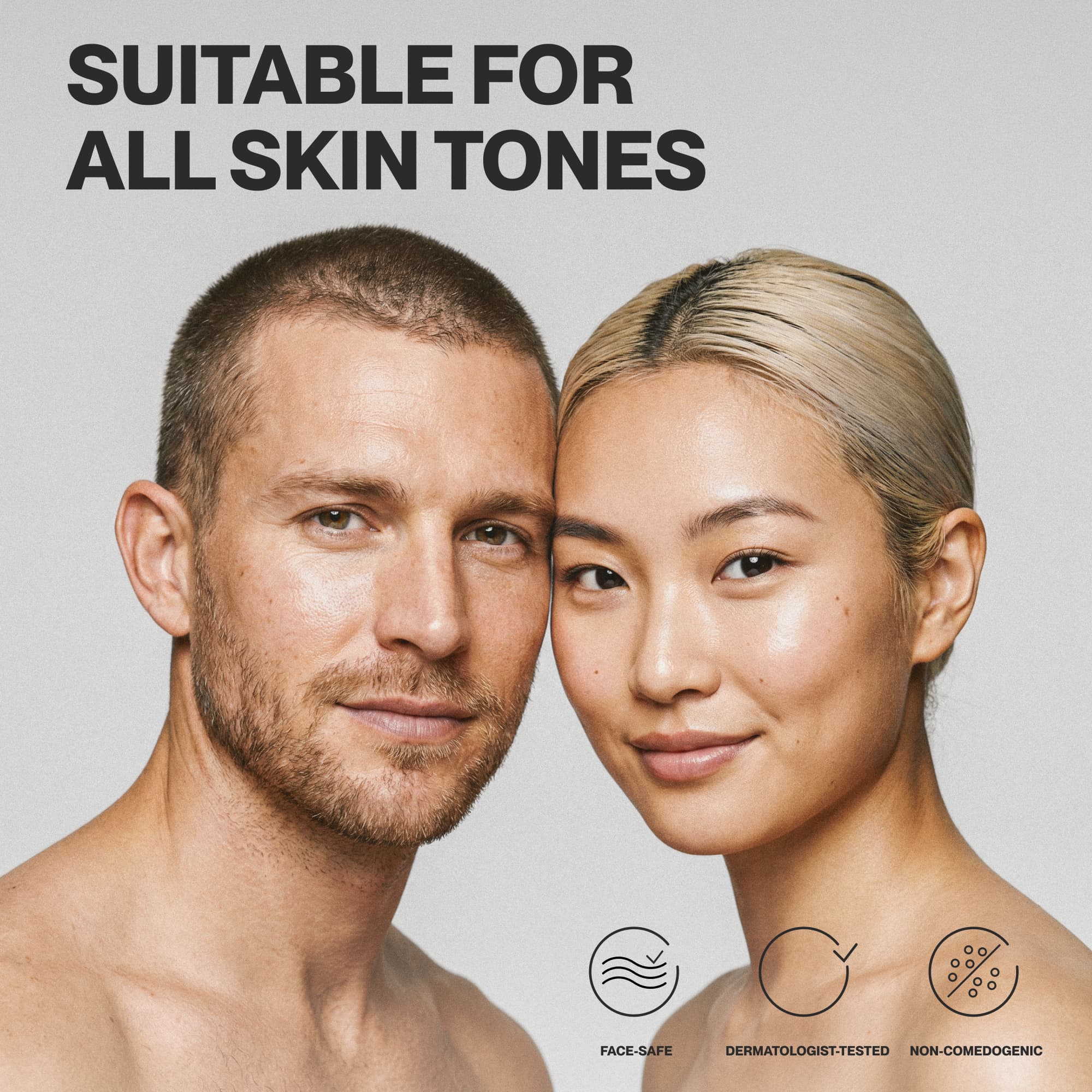
Packaging design, art direction, campaign imagery, 3D renderings, Amazon store design
Industry
Beauty & personal care | Self-tanning




Related projects →

© 2026
time:

ISLE OF PLANTS
Skin-first self-tan made to feel like skincare
Isle of Plants is a plant-based self-tanning line from Quebec, rooted in the science of color-correcting. The client came with a bold brief: completely ignore the traditional bronze and orange packaging codes. In response, the identity embraces an intentional green palette that directly references the anti-orange theory behind the formula.
Since the brand is proud of its Quebec roots, using Montreal’s iconic PP font family was an obvious choice that just felt right. By pairing these local typographic lines with a clean, raw layout, the packaging system brings the founder's vision to life – turning a basic tanning product into an intentional, science-backed skincare ritual.
Feel your best summer day every day
Year
2025
Scope
Packaging design, art direction, campaign imagery, 3D renderings, Amazon store design
Industry
Beauty & personal care | Self-tanning
Related projects →


© 2026

ISLE OF PLANTS
Skin-first self-tan made to feel like skincare
Isle of Plants is a plant-based self-tanning line from Quebec, rooted in the science of color-correcting. The client came with a bold brief: completely ignore the traditional bronze and orange packaging codes. In response, the identity embraces an intentional green palette that directly references the anti-orange theory behind the formula.
Since the brand is proud of its Quebec roots, using Montreal’s iconic PP font family was an obvious choice that just felt right. By pairing these local typographic lines with a clean, raw layout, the packaging system brings the founder's vision to life – turning a basic tanning product into an intentional, science-backed skincare ritual.
Feel your best summer day every day
Year
2025
Scope
Packaging design, art direction, campaign imagery, 3D renderings, Amazon store design
Industry
Beauty & personal care | Self-tanning
Related projects →


© 2026